
Choosing the right cushion colours can transform your room’s style and mood, making your space feel inviting, balanced, and perfectly tailored to your personal taste.
This guide will simplify that process by helping you understand your room’s existing colours and how to build a cushion palette that complements your space. We’ll explore a range of colour palette approaches, so you can confidently select new cushion covers that enhance your home’s atmosphere.
Whether you want a calm, cohesive look or a vibrant pop of colour, these practical tips and palette ideas will make your styling decisions easier and more enjoyable.
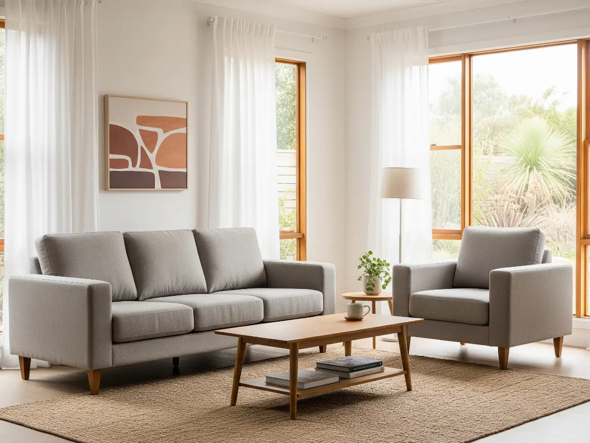
Understanding your room’s colour scheme
The goal of this step is to help you identify your room’s dominant colours, furniture tones, some desirable accent shades, and its overall mood. This understanding will guide you to select a colour palette (the next step) and, eventually, to choose your cushions.
Dominant colours
Start by observing the room’s largest surfaces, your walls and flooring. Light-coloured walls and floors give you the freedom to choose richer colourful cushions, while darker or brighter backdrops may call for muted tones or neutrals to keep the space balanced.
Furniture colour
Look at the surface where your cushions will live, your sofa, bed, or seating. Is it a neutral shade like beige, grey, or navy, or a bolder colour like green or red? This will influence whether your cushions should be a neutral colour like black to tone things down, tonal to complement, or vibrant for contrast.
Accent colours
Notice any pops of colour you like in your existing textiles and accessories like your rugs, throws, curtains, artwork, or decor pieces. Pulling from these accent colours can create cohesion and add layers to your design.
Your rooms mood
Consider the function and feel you want your room to capture. Is it a busy or calm space? Do you want it to feel energised or relaxing? Calming, neutral or tonal cushions work well in quiet lounges or bedrooms, while bolder colours like red can bring energy to social spaces.
With these questions answered, you’re ready to explore our suggested colour palettes. Use what you’ve learned here to choose the palette that best suits your space and personal style.
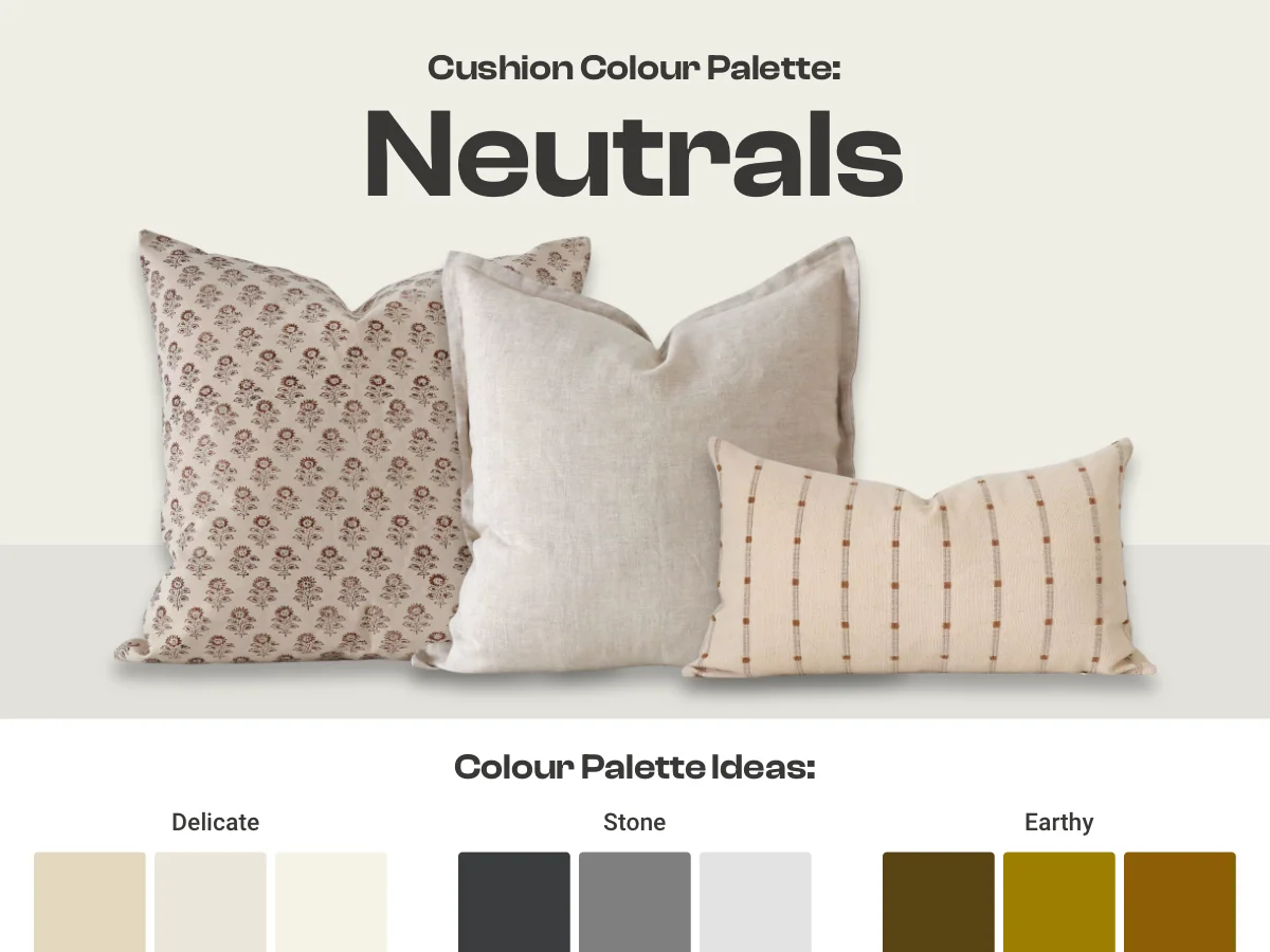
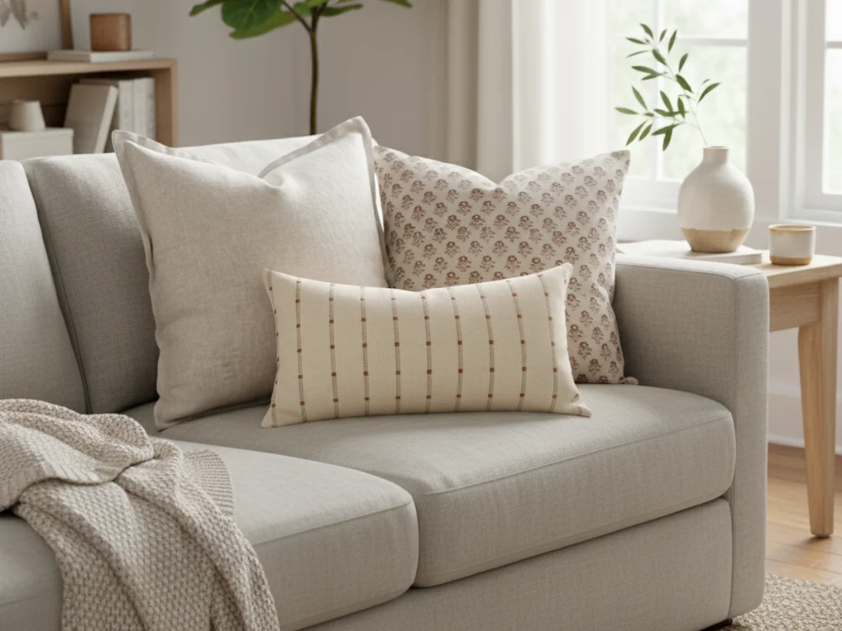
Neutral palette
A neutral palette features cushions in muted tones that effortlessly complement a wide range of styles and colour schemes. These shades provide a subtle and versatile accent, adding depth and harmony without overpowering other elements in the space.
Examples:
- Soft cream, sandy beige and warm taupe for soft, natural warmth.
- True grey, deep charcoal and muted black for sleek, subtle depth.
- Delicate ivory, pale stone and soft white for fresh, airy elegance.
- Rich brown, buttery caramel and earthy clay for a cosy, grounded feel.
When to use it:
Neutral palettes are perfect if you want a subtle, sophisticated look that doesn’t compete with other elements in your room. They work well in minimalist, modern, and classic interiors and are ideal if you prefer a calming, cohesive atmosphere. Neutrals are also a great base if you like to update your look seasonally with accent cushions or throws.
Benefits:
Using neutrals offers maximum flexibility, they effortlessly blend with various furniture colours and textures. They make your cushions feel light and elegant while allowing other decor pieces or statement cushions to stand out. Neutrals are easy to style and maintain a timeless appeal, making them a safe yet chic choice for any space.
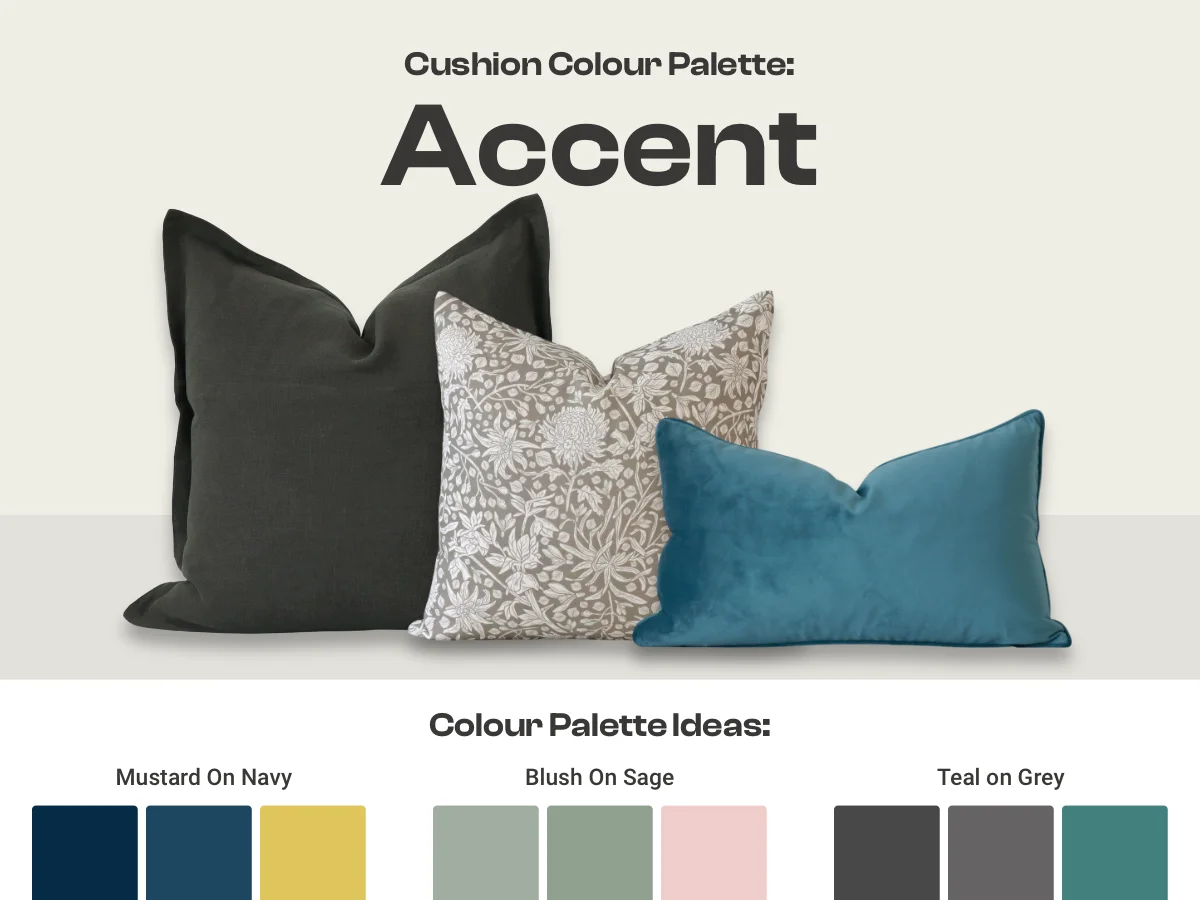
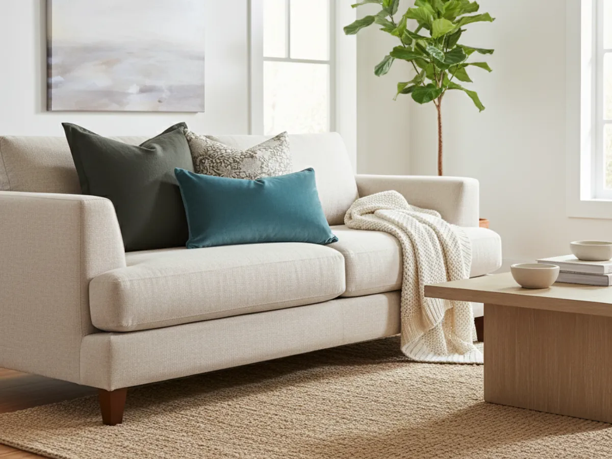
Accent palette
An accent palette focuses on using neutral or subdued monochrome coloured cushions as your base, then introducing one or more accent cushions that stand out, either through bold solid colours or multi-coloured patterns and motifs.
Examples:
- A base of navy and deep blue cushions with an accent piece in rich mustard.
- Layered base of monochrome sage cushions with an accent piece in soft blush.
- A base of light grey and charcoal cushions with an accent piece in deep teal.
When to use it:
Accent palettes are perfect if you want a mostly calm and versatile cushion setup but still desire bursts of colour to enliven your space. They suit rooms where you want the flexibility to swap out accent cushions seasonally or according to mood. They add vibrancy without overpowering your space.
Benefits:
Using an accent palette offers easy refreshment of your decor by changing just a few cushions. It balances calm with excitement and directs attention where you want it, making your cushions both stylish and inviting. It allows you to introduce bold colours in a controlled way.

Monochrome palette
A monochrome palette uses variations of a single colour across your cushions. This means choosing one base colour and mixing different tints, shades, and tones of that colour to create subtle contrast and depth without introducing new hues.
Examples:
- Cool mint green, earthy olive green and forest green for a natural vibe.
- Pale powder blue, airy sky blue, and rich navy blue for a calming effect.
- Soft blush pink, muted dusty pink and bold deep pink for a romantic feel.
When to use it:
Monochrome palettes work well when you want a calm, sophisticated atmosphere. They’re ideal for minimalist, modern, or Scandinavian-inspired interiors where simplicity and subtlety are key. This palette also helps create a sense of continuity when your furniture or decor already features a dominant colour.
Benefits:
Using a monochrome palette is foolproof for achieving balance and unity in a space. It allows you to play with texture and pattern without overwhelming the eye. Plus, it’s easier to refresh your look by swapping out cushions in the same colour family without having to rethink the entire palette.
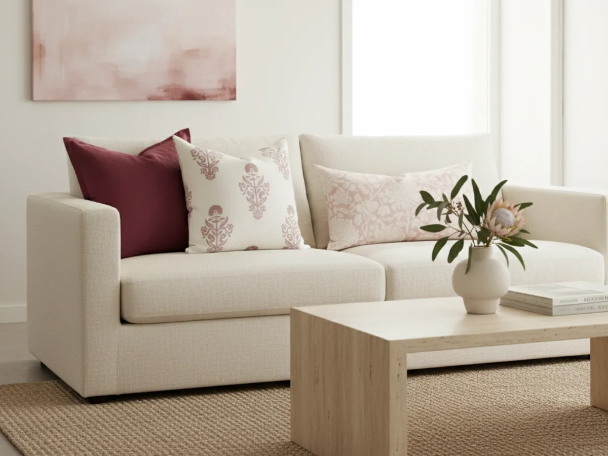
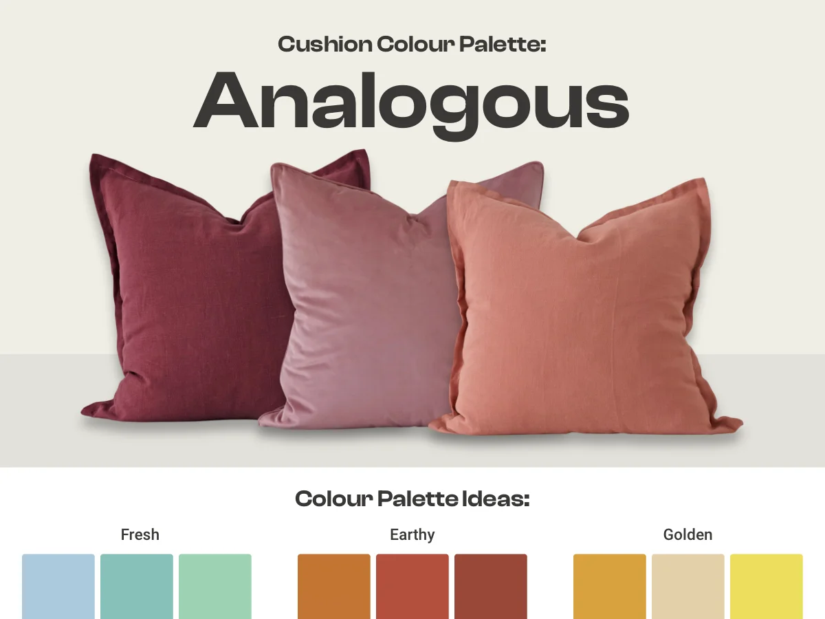
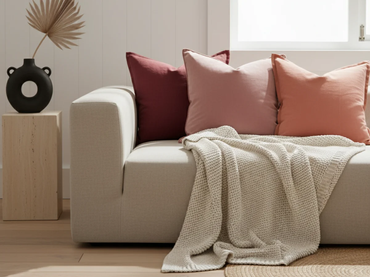
Analogous palette
An analogous palette combines multiple colours that sit next to each other on the colour wheel. This approach creates a harmonious and cohesive look by blending hues that share similar undertones and naturally complement each other.
Examples:
- Soft sky blue, fresh aqua and gentle seafoam green for a serene atmosphere.
- Rich burnt orange, warm rust and earthy terracotta for a cosy, autumnal feel.
- Vibrant mustard, warming beige and sunny golden yellow for a cheerful space.
When to use it:
Analogous palettes are perfect when you want a space that feels coordinated and soothing but with a little more variety than a monochrome scheme. They work well in casual, contemporary, or nature-inspired interiors where gentle colour transitions add warmth and interest.
Benefits:
This palette strikes a balance between unity and diversity. The neighbouring hues flow smoothly together, making the arrangement feel intentional yet relaxed. It also allows for subtle shifts in mood and energy without stark contrasts, which can be calming and inviting.

Contrasting palette
A contrasting palette combines colours that sit opposite or far apart on the colour wheel, creating a dynamic and eye-catching look. This approach uses bold differences to make each cushion stand out, adding energy and personality to your space.
Examples:
- Deep navy and vibrant burnt orange for a bold and energetic statement.
- Bright mustard yellow and rich dark purple for a striking and lively contrast.
- Muted olive and soft blush pink for a playful yet balanced look.
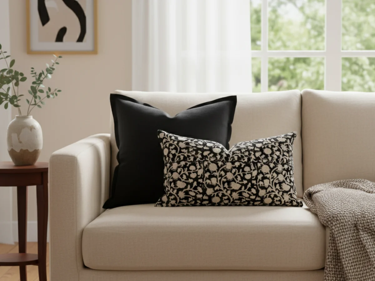
- Beautifully crisp black and white for a timeless and dramatic effect.
When to use it:
Contrasting palettes are ideal when you want your cushions to serve as statement pieces or focal points. They work well in modern, eclectic, or vibrant interiors where you want to add a punch of colour and visual interest.
Benefits:
Using a contrasting palette brings boldness and excitement to your room. It can energise neutral furniture or complement existing colourful decor. This approach encourages creativity and allows you to mix different styles while maintaining cohesion through deliberate colour choices.
Wrapping up
Choosing the right colour palette for your cushions can transform your space, creating a look that feels cohesive, inviting, and true to your style. By understanding your room’s existing colours, furniture tones, and overall mood, you’ll be equipped to select a palette that will make choosing cushion colours easy.
Whether you prefer the timeless elegance of a neutral palette, the gentle harmony of analogous hues, or the dynamic energy of contrasting colours, there’s a colour strategy here to make styling simple and enjoyable. With your colours sorted, you can easily jump to our cushion combo formulas for simple step by step styling.
Use this guide as your roadmap to picking cushions that complement your home beautifully and express your unique personality. With the right palette in hand, styling your cushions will feel both effortless and rewarding.


